
Choosing a Color Palette with Confidence

Want to bring bold color into your space, but don’t know where to begin? We asked maximalist designer and founder of Boldly Elegant Home, Lauren Budilov Piafsky, to share how she chooses a color palette with confidence. Follow along as Lauren shares how she strategically chose each brightly-colored piece for her NYC living room—starting with the LOVE Hapi Art print.
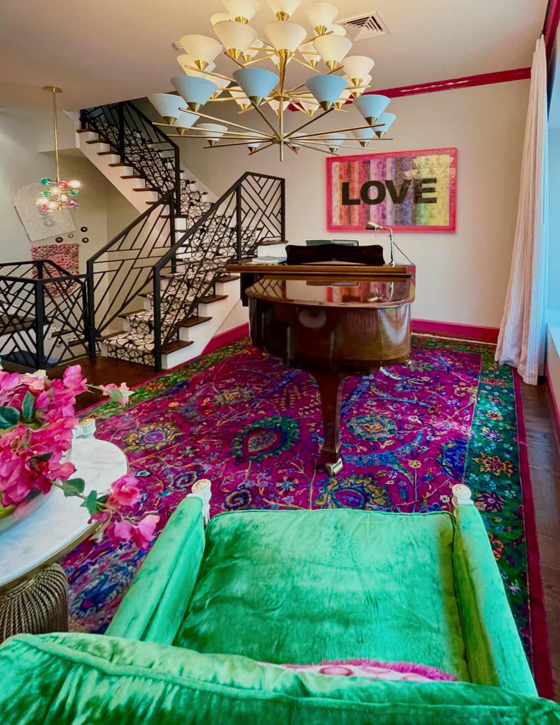
When designing a space, I tend to start with a pattern, print, or texture that draws me in, which ends up being the "theme" of the room. I had fallen in love with Hapi Art well before I had a proper place for it; so when the time came for me to move into my forever home, the LOVE piece—with its striking black letters, oh so dreamy diamond dust, and rainbow colors—was a MUST have. I didn't know where it was going to live, but I knew it had to be in the Boldly Elegant HeadQuarters.
Patterns, color, and prints are the epitome of my style, both in fashion and at home along with a genuine love for vintage. Fashion, home, and design has been a hobby of mine for as long as I can remember and I have dedicated my professional career to the industry. I have a lot of "coffee table books" on design houses, but they aren't for show...I have actually read them all!

After working at Ralph Lauren for 9 years I knew the quality behind their pieces, and while searching for chairs for the piano room, I came across velvet green vintage Ralph Lauren chairs and snapped them up in a New York minute. When I purchased them, I was unsure of what the condition of the velvet would be, but when they arrived I was pleasantly surprised with their perfectly worn vintage look and decided NOT to reupholster them, which is unusual for me, because I LOVE hunting for and finding amazing fabrics.

Texture is so important in any room. It makes a solid more interesting or a print even better, and it enhances the overall feeling of luxury of any fabric despite the price tag.
Wanting to preserve the chairs, the velvet green actually checked all of my boxes. I knew we were working with emerald green, so this gave me a starting point for the piano room.

My brand's logo has a similar color story to the Hapi Art LOVE piece, which is a rainbow of vibrant colors. I chose to make my logo rainbow colors because colors evoke happiness and can instantly change your mood. I wanted my brand to teach people NOT to be afraid of bold colors and prints, say “no” to the beiges and grays, and show people that more really is more, and that mixing colors and prints is the highest form of fashion.
The LOVE piece is so striking, and like my logo, is so versatile because it has ALL of the colors in it. It's a piece that makes building a room around it so easy because it can work with just about everything. Whatever you have in your home, there's a very good chance it's going to match a piece from Hapi Art, because Kristi does color so brilliantly.
The piano room can be viewed from the street while walking by my space, and since the LOVE piece is exactly the vibe I wanted people to get from my house, I decided the piano room was the perfect place for my first Hapi Art piece. The colors of the art allow you to move in whatever direction you would like—the combination of my vintage green chairs with the art really jump started the room.

Pink is a favorite of mine, and I loved the hot pink lucite frame of the LOVE piece. I build my rooms by collecting each individual piece and work it into a story, which many times is created as I go (which is why I love the "build" process so much). The pink lucite frame became the next step in designing this particular room. I took the pinks in the piece and began searching for a hot pink persian rug. Hot pink is bold, like the art, and my mind was made up—we were going for pink!
Kristi's pieces are so special because they have so much color, making them EASIER to work with. Lots of colors tend to scare people, but my advice is to pull out a grouping of your favorites and build a room around it. The same goes for mixing prints—select a grouping of colors and look for fabrics that have the same color story and/or theme. There is a time and a place for a solid, but make sure there's something interesting about it: a velvet, nubby tweed, raw silk, etc. It's important to make your solid "relevant" and intriguing.
There's a ton of research on the psychology of color and texture. It's truly incredible how subconsciously mixing colors or choosing textures stimulates the brain! When designing any of my rooms, I want people to have an enjoyable experience. Every room in your house should transform you somewhere differently, yet somehow, the mixture of them all must work together. This can be achieved best by committing to a color scheme. It can come from anywhere, just pull out a grouping of colors that you love together and start building!
The rug I found was a perfect match to the chairs and the art. With the pinks, greens, and yellows, it was a done deal as soon as I found it. In general, I tend to start off my rooms with a color, print, or texture, and in this case the green and pink combination was what I was building upon.

Since it was a mostly pink room, I needed to find something masculine to balance out the use of hot pink as my room's base color. A lot of interior designers start from the rug up. In some cases, I do this, but not always. That being said, I do believe that the rug in any room is the room's base and in this case, my base was hot pink.
Another good rule of thumb is to make sure you balance your fabrics and prints. Even a pink space should have something masculine in order to round it out and really ground it. I was hoping for a plaid or a pinstripe when selecting my drapery and luckily found the hot pink and white pinstripe. That was NOT an easy search. When selecting art for the other wall in the room, I needed something bold to go across from my LOVE print.
When purchasing art for opposing walls, make sure it's not a competition between which wall is better than the other, and choose art that balances both walls instead. Each opposing wall should add value to the other versus taking value away. All of the art in my house is 3D in some way. I love the added dimension and think 3D art overall is more interesting.

BEHQ is dripping with pop art, and the Jonathan Adler beaded lips had just the right composition to team up with Kristi's piece. I love the combination of pink and red and the JA art allowed me to incorporate it seamlessly into the space. Purchasing the lips led me to my next color and step: red! My house was made with a ton of beautiful wood, but my heart gravitates towards color, color, and more color, and while I respected the beautiful quality of the wooden bar, it wasn't bold enough for BEHQ; so I gave my bar a facelift by painting it lipstick red, using my pantone color deck to get the perfect match to the lips.
Before you get rid of or demolish something, ask yourself, would a fresh coat of paint do the trick? Painting is a more cost effective way of getting the look that you want, and in this case, it was the right way to go. I wanted to continue to bring the pink and red from the art into the room as well as add another masculine print to my mix and came across the geometric pink and red velvet fabric by Manuel Canovas. Texture is so important. It instantly adds interest to the piece, whatever it might be as well as an instant pop. The geometric print was a good masculine balance to my pink Palm Beach room; so I had the lumbar pillows made for my vintage green chairs.

When choosing a fabric for the piano bench, I really wanted to bring out the colors in the LOVE print and on a visit to the D&D building I came across another Manuel Canovas beauty—an embroidered fabric that had a ton of texture, which I am always naturally drawn to. The embroidered fabric looked great with the LOVE piece as well as with the other selections in the room.
For lighting, I am of the mindset that bigger is always better if you have the ceiling height to support the size. This room has 11' ceilings, which I thought were high enough for a giant chandelier by Kelly Wearstler, but when the 32-light chandelier came in, it took 12 hours and 4 people to attempt to put it up, but in the end, it was too big! I was in love though and had to figure out how to make it work; so I contacted the company who manufactures the chandelier and had them make a custom piece that was shorter than the oh so beautiful longer piece the chandelier was intended to connect and hang from.
It is not uncommon to run into a speed bump as you decorate your spaces, which makes it incredibly important to be solution-oriented and find a way to make whatever purchases you have made, especially if they are not returnable, work for your space!

SHOP LAUREN'S FAVORITE HAPI DECOR
After another 8 hours with some pros, she was up! I had thought my room was finished, but with all of these elements working so seamlessly together, something was still missing. It was here that I decided when there's molding, your room has a frame, and no frame of mine was going to be left white! When viewing the space it was obvious that the molding had to be hot pink.
When choosing a color for your moldings, there are a few ways to determine the best one for your space. In this case, I decided to pull out the room's dominant color: pink. Another way to select a trim color is by pulling out a color that balances the room and is also repeated in the design more than once. I pulled out my pantone color wheel and found a perfect match to the rug, drapes, pillows, and art and voila, my Palm Beach piano room was complete!
FOLLOW @BOLDLYELEGANTHOME
Leave a comment